Visiolab
Project type
Consulting
Deliverables
Web App UI/UX
Visiolab
Project type
Consulting
Deliverables
Web App UI/UX
Visiolab
Project type
Consulting
Deliverables
Web App UI/UX
Developing a canteen management system for business stakeholders.
Visiolab serves as a consumer-facing mobile app primarily focused on optimizing the checkout process for customers. Through the integration of a food recognition system, the app automates checkout, resulting in expedited payments for customers. Additionally, this innovation empowers business owners to enhance operational efficiency without the necessity of hiring additional cashiers.
The project goal was to provide design guidelines and offer close assistance to frontend developers in implementing new information architecture and user flows for the desktop app aimed at business owners.
Design process
Starting a new collaboration involves diving into a design UI/UX audit to understand available resources and address practical design issues, ensuring smooth scalability and alignment with the team.
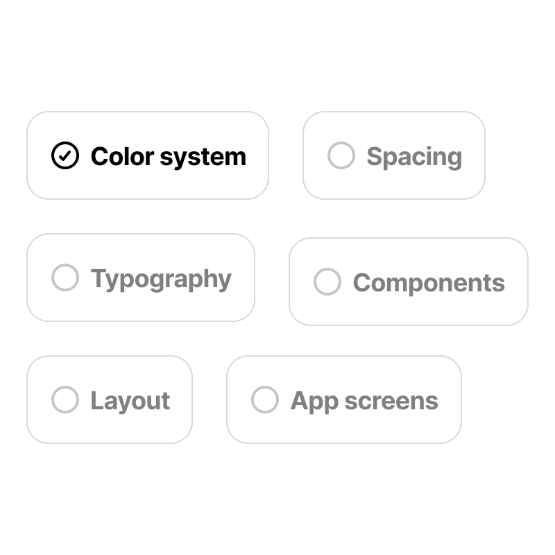
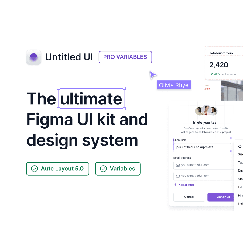
Startups aim to iterate quickly, which means setting up a basic design system or even adopting an existing one. Untitled UI is typically my default choice.
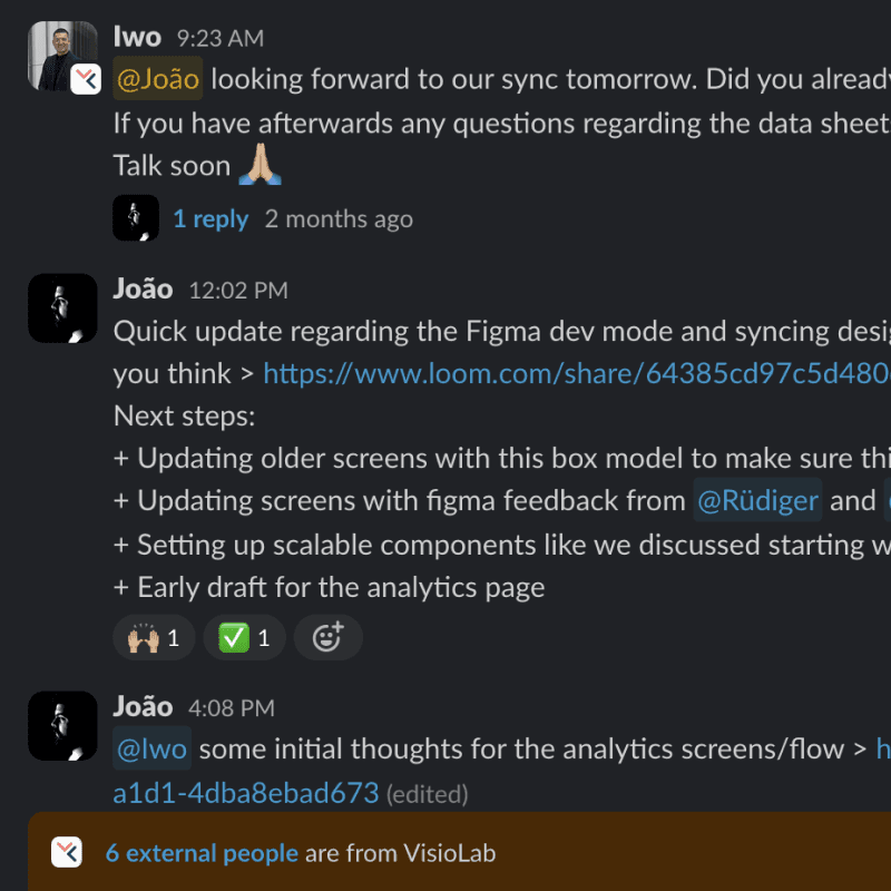
Close collaboration and communication are key to shaping the best possible product. Slack and Loom are my tools of choice for keeping everyone in the loop with regular updates.
Design process
Starting a new collaboration involves diving into a design UI/UX audit to understand available resources and address practical design issues, ensuring smooth scalability and alignment with the team.
Startups aim to iterate quickly, which means setting up a basic design system or even adopting an existing one. Untitled UI is typically my default choice.
Close collaboration and communication are key to shaping the best possible product. Slack and Loom are my tools of choice for keeping everyone in the loop with regular updates.
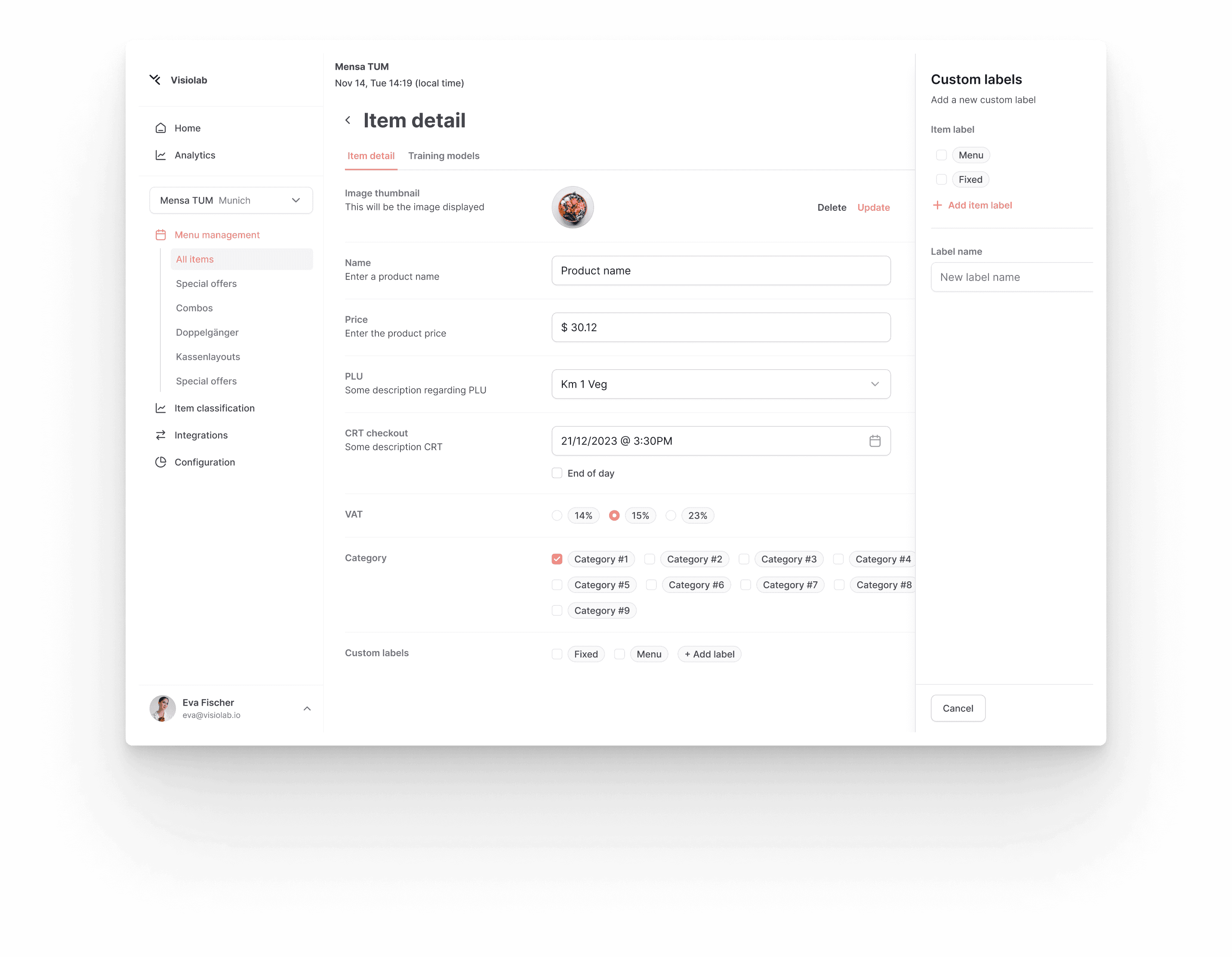
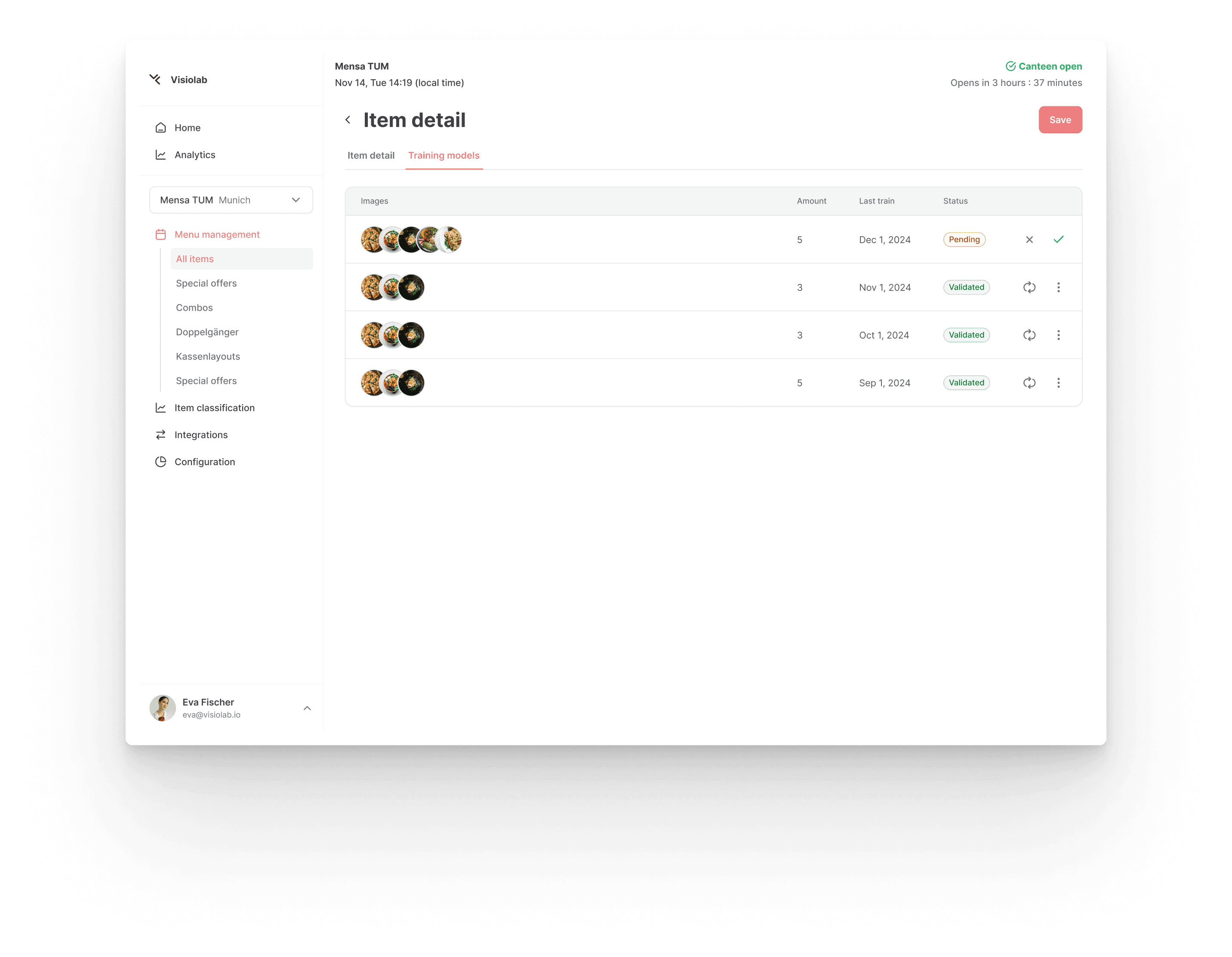
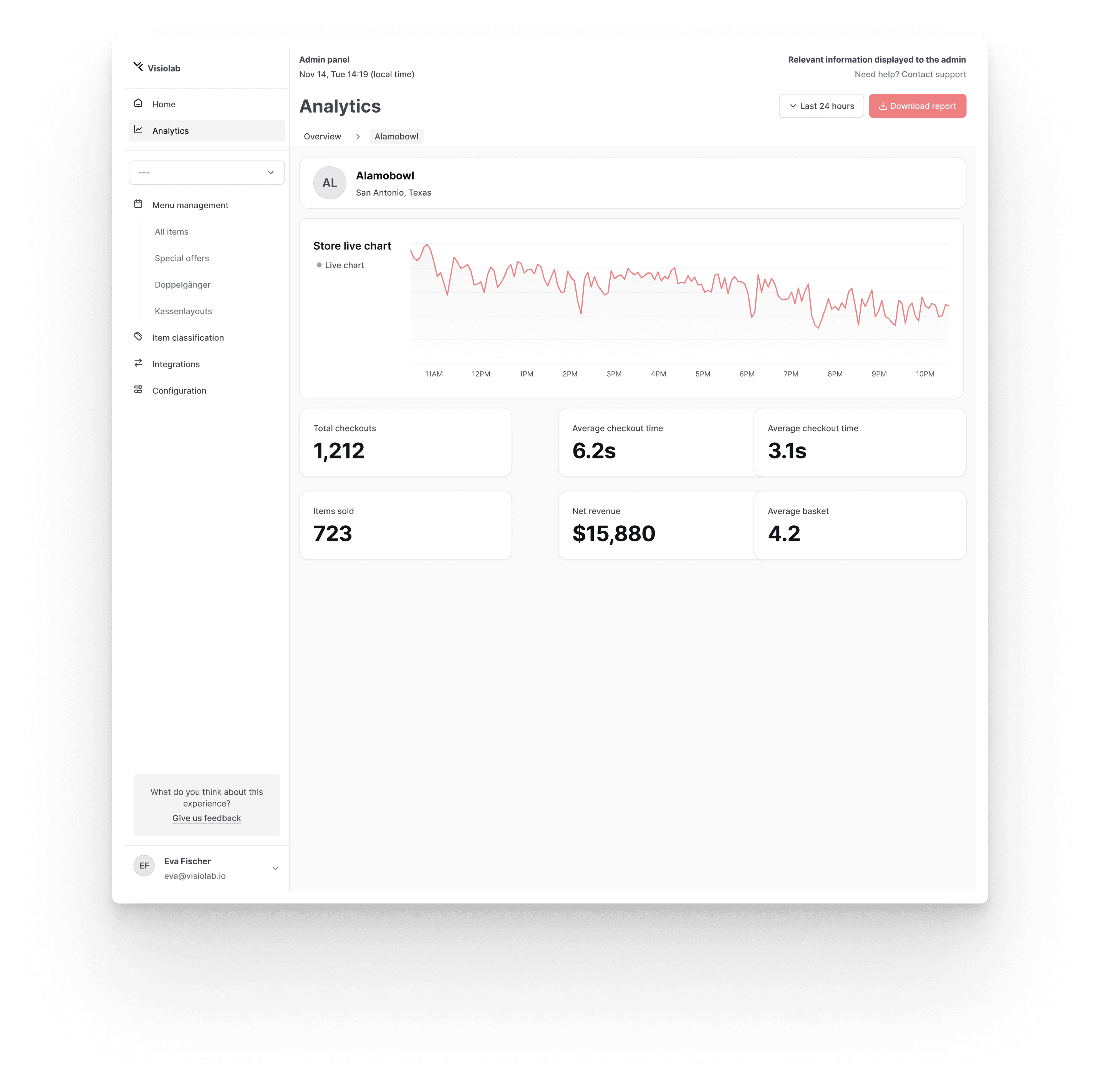
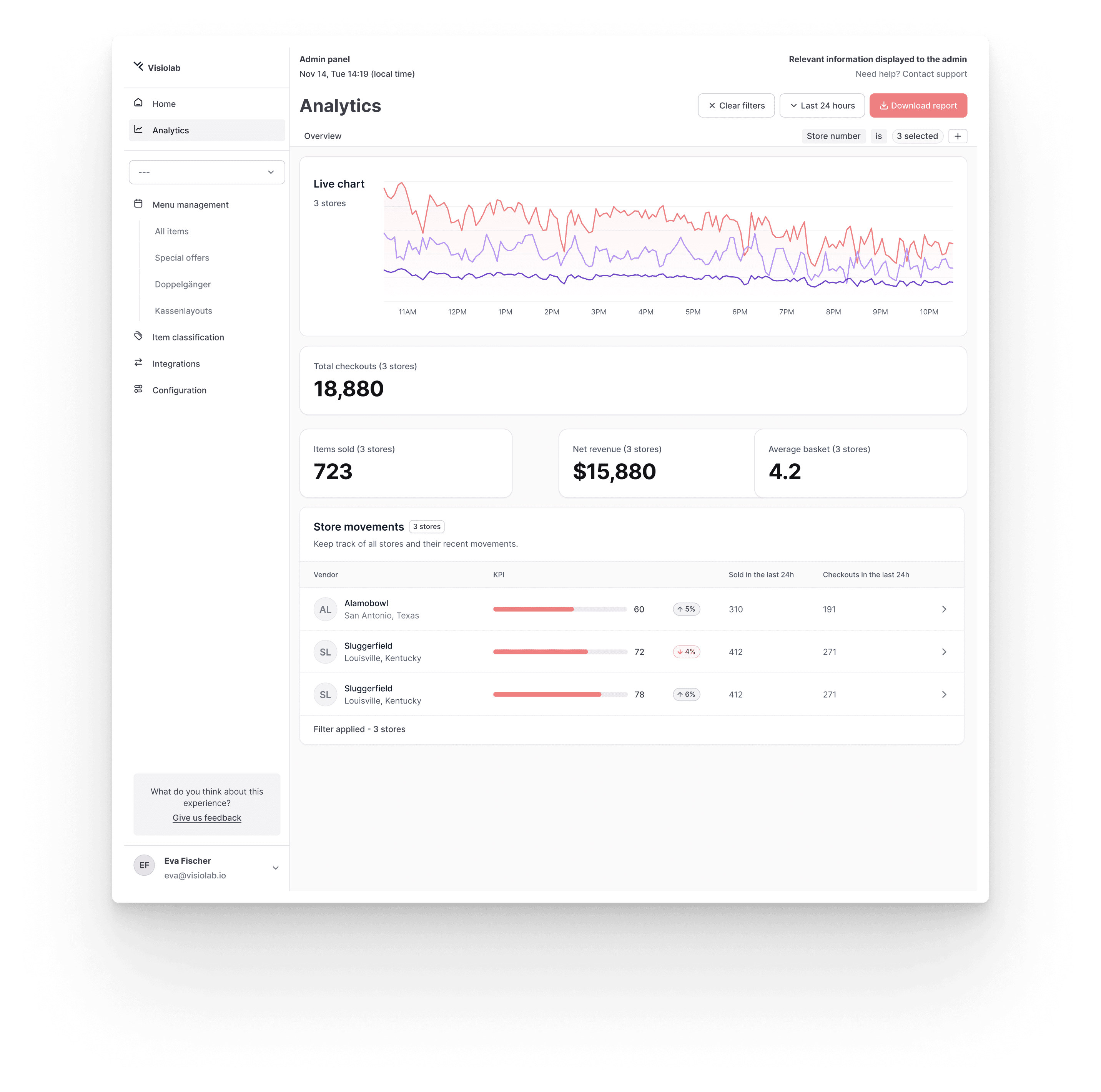
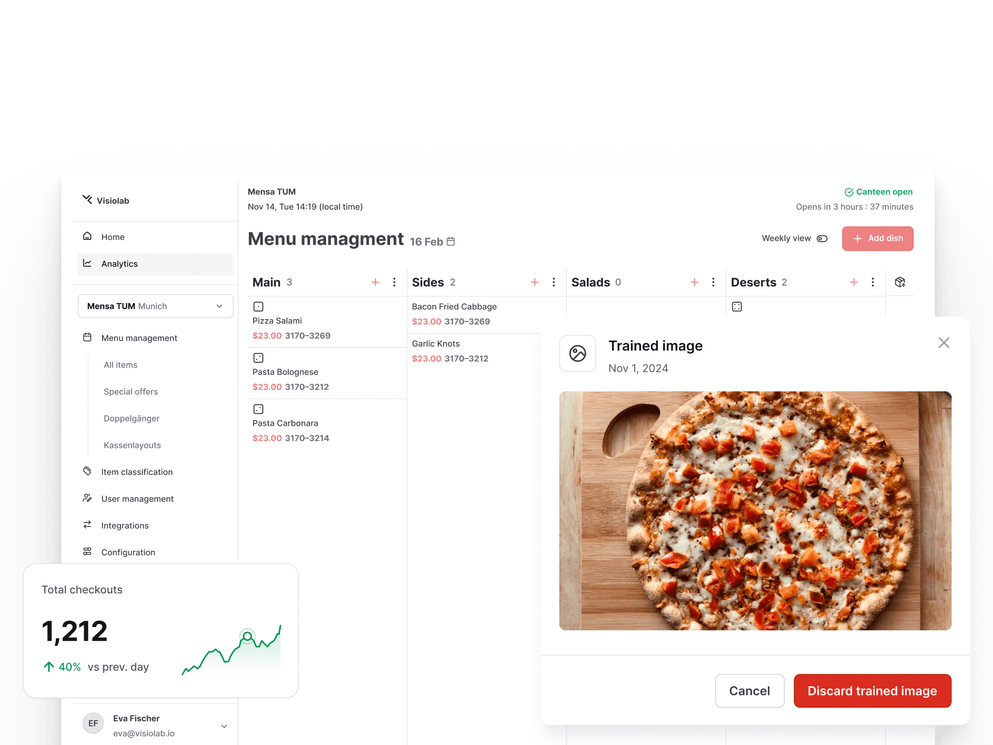
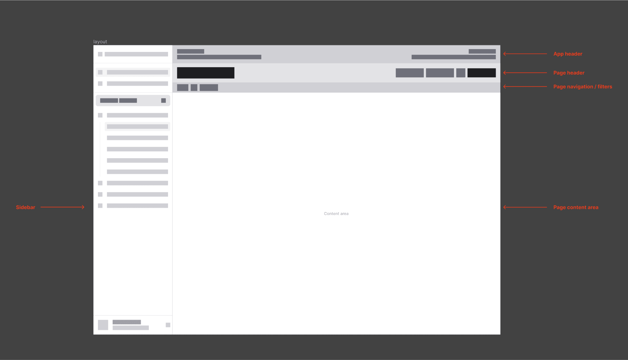
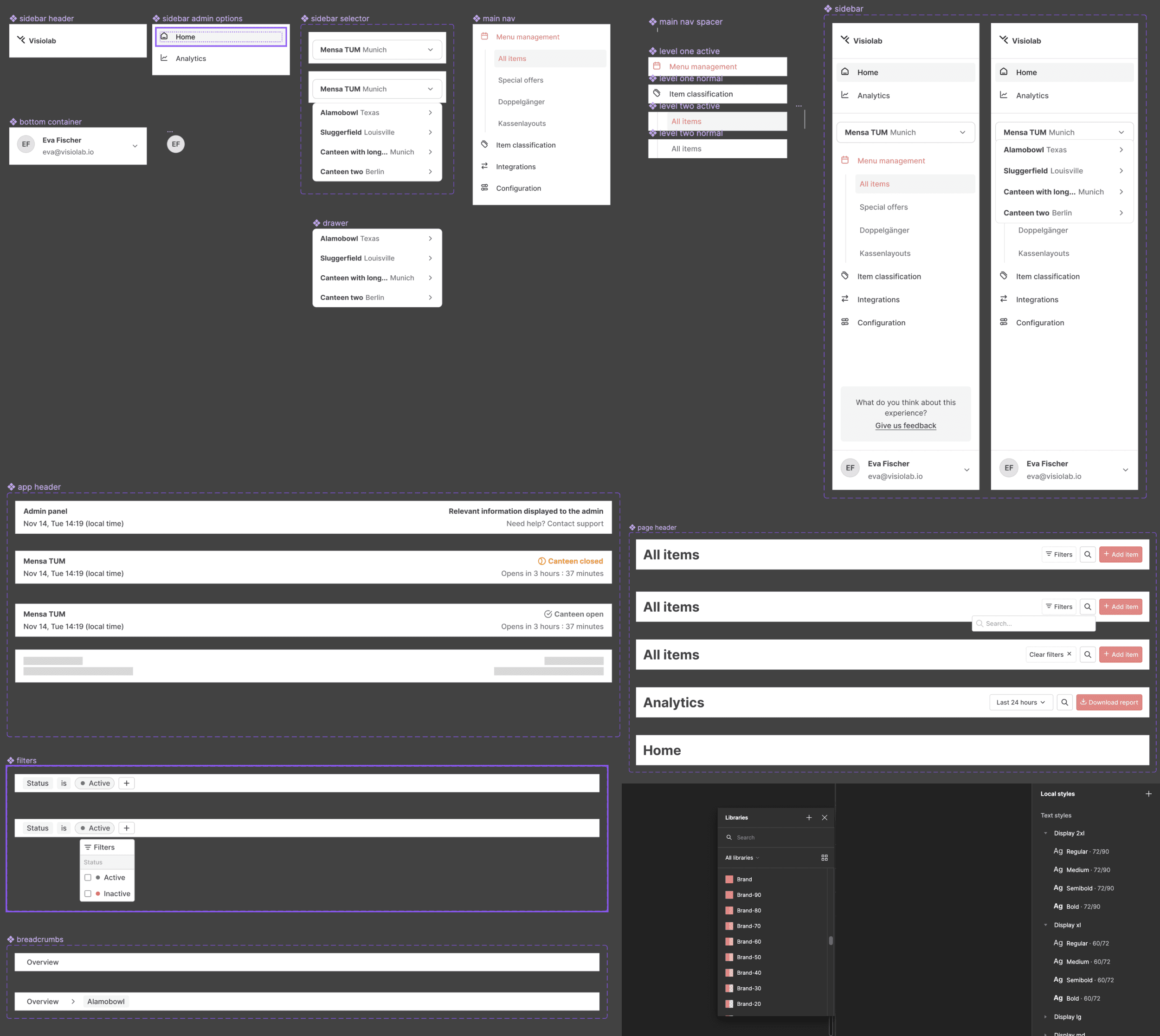
Defining the information architecture for the app enabled us to make progressive improvements to its components.
The main goal of the project was to define top priorities and establish a foundation for the app to grow consistently. Knowing from the outset that the frontend would be built using TailwindCSS, the decision to use UntitledUI was made, as it is clearly one of the best solutions for translating Figma designs into code.
We began by undertaking a major rework and reorganization of the navigation system. Simultaneously, we initiated the development of the appropriate component system for the various areas of the layout. Facilitating the design-to-development handoff was a significant aspect of this collaboration. To ensure clarity and alignment, we created regular videos to explain design decisions throughout the process. This approach also facilitated a deeper understanding of my design rationale by the development team.
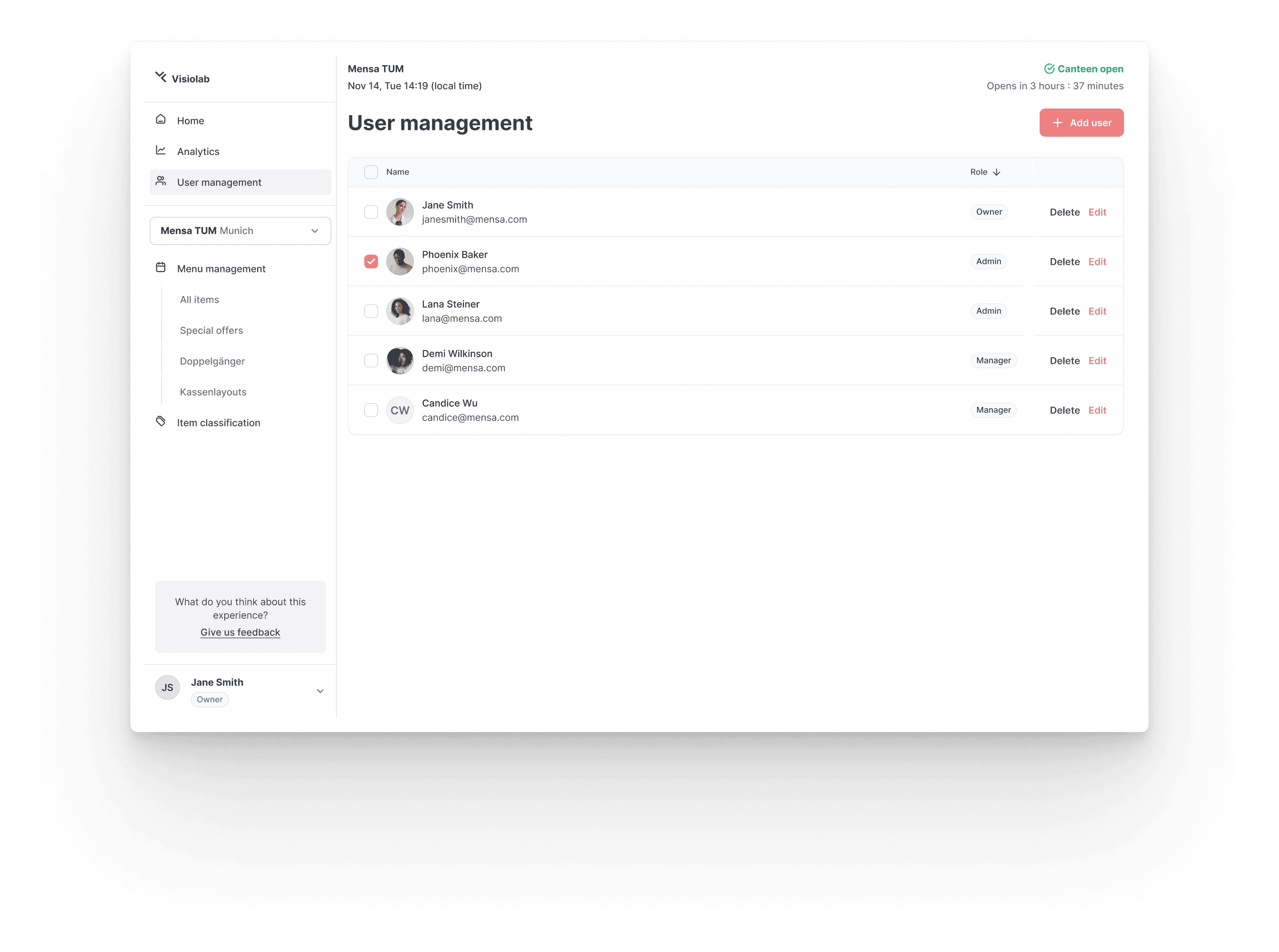
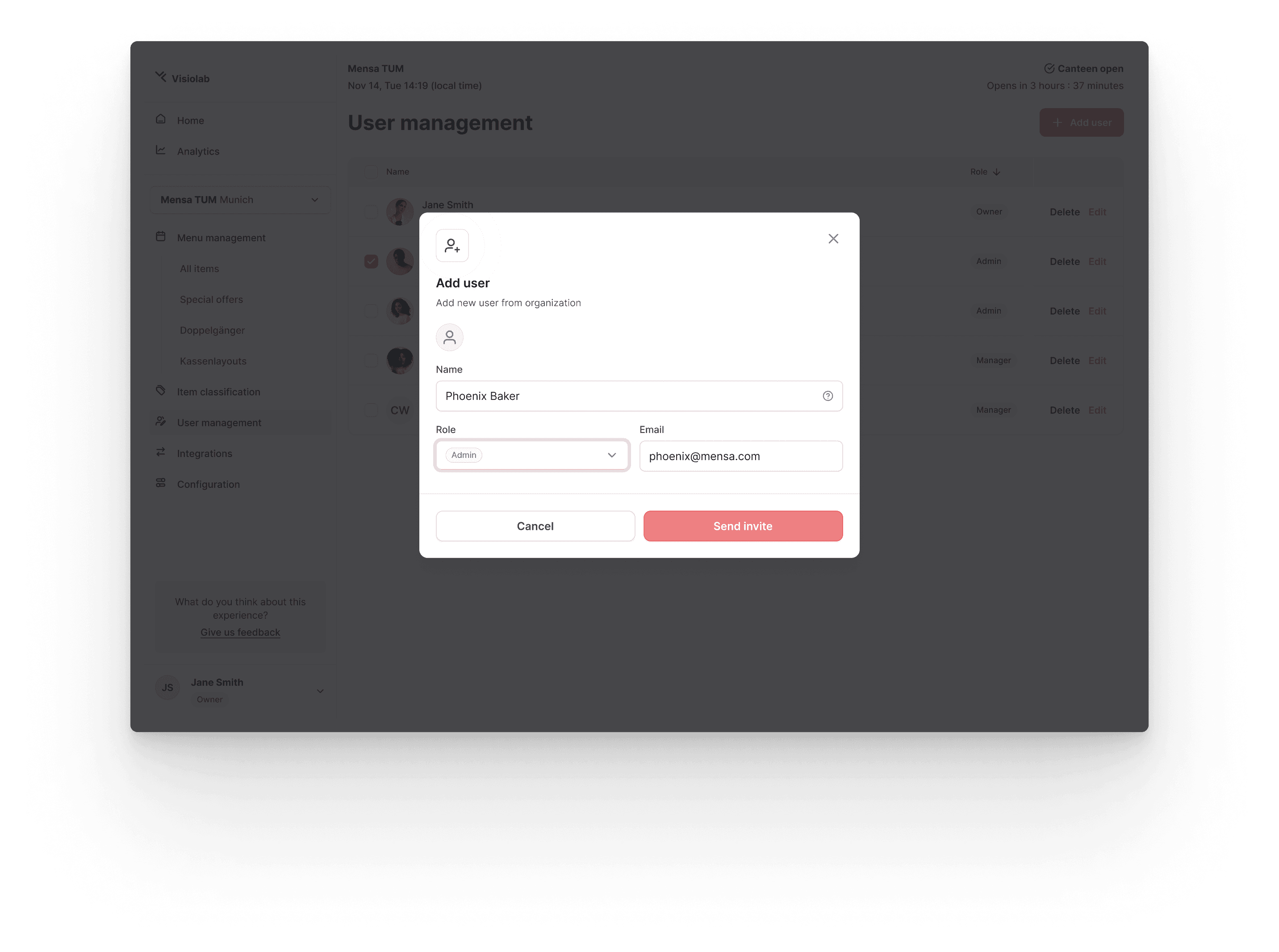
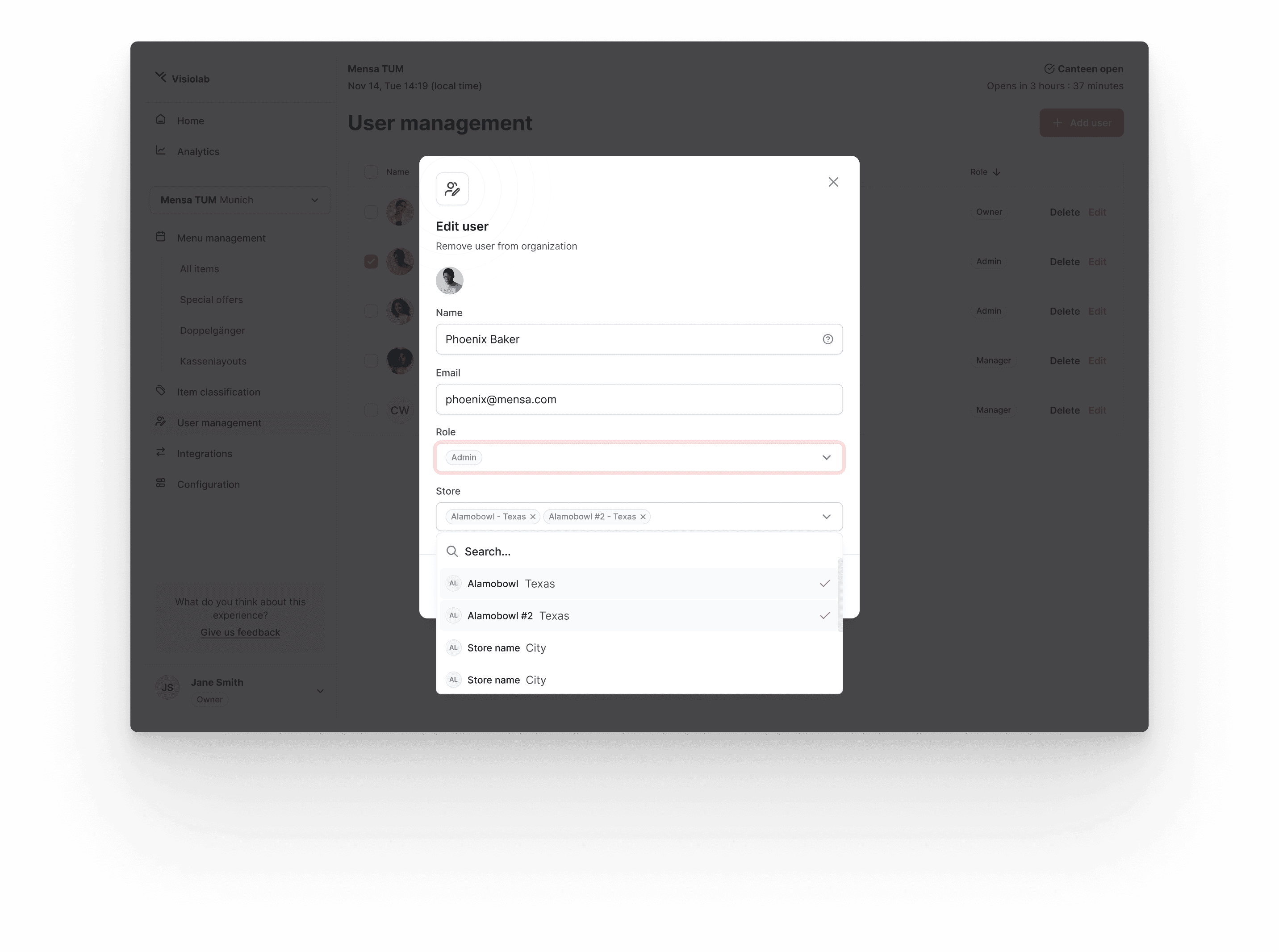
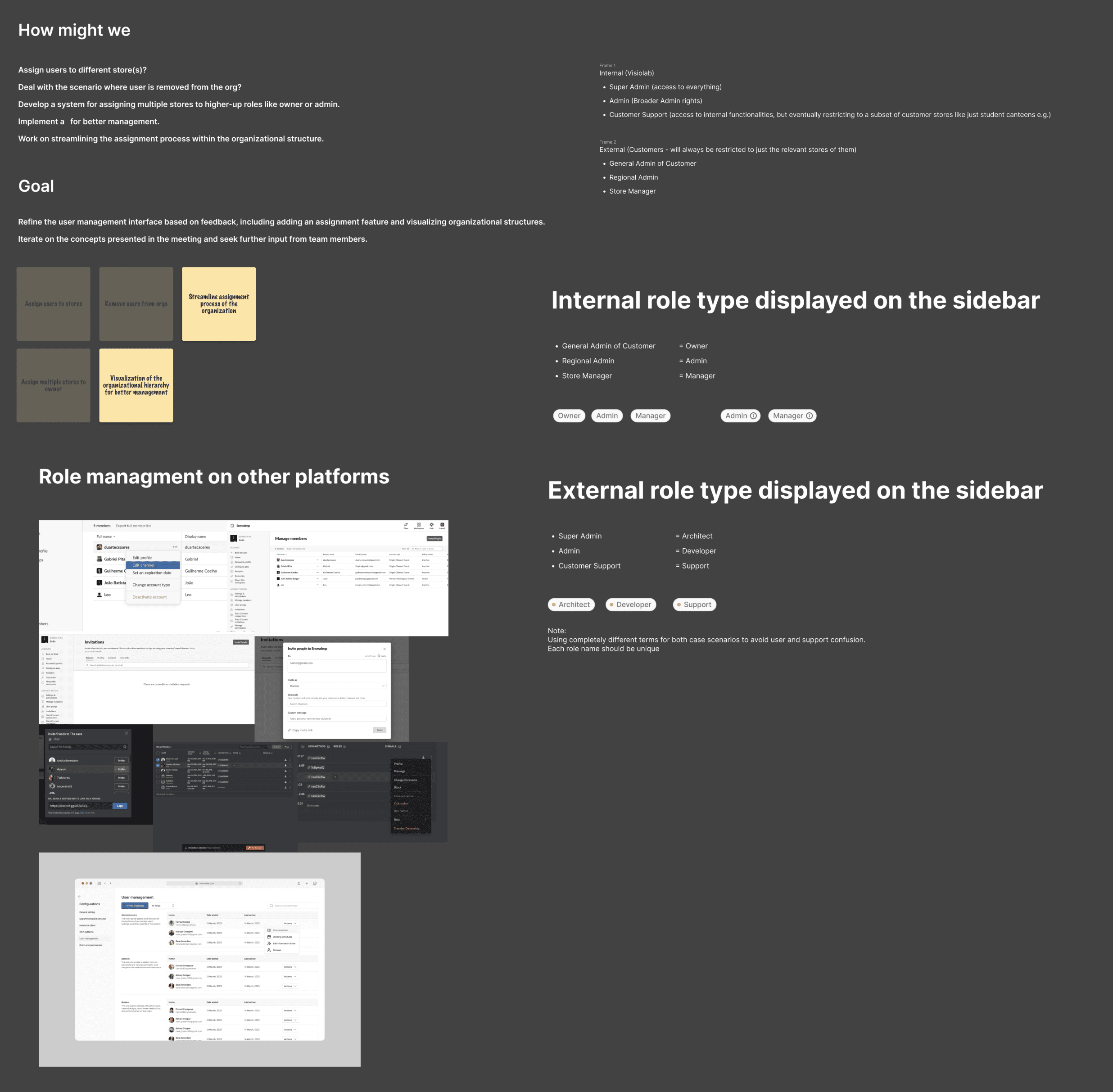
Proving a clear path to improve the product by defining core problems and providing solutions.
Even without major feedback form the users of the web app we knew by the get go that it would be important to define a core structure and naming conventions for user management while also provide a clear hierarchy for the user roles.
This provided internal alignment to prevent terminology confusion in the future, especially if there is a need for customer support to address issues related to specific roles.
Bring up the results while adapting to every team's workflow.
This collaboration aimed to provide a strong foundation by establishing a framework for the fast-paced development of the front-end team. Therefore, there was a strong emphasis on collaborating with the founders and developers to build systems that could scale easily.